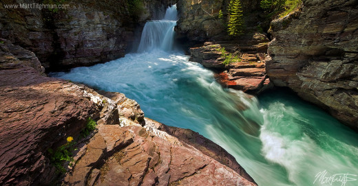
Photoshop workflow for Landscape Photography: St Mary Falls, Glacier National Park

First, import RAW photos in Adobe Camera Raw
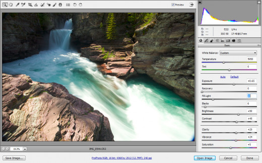
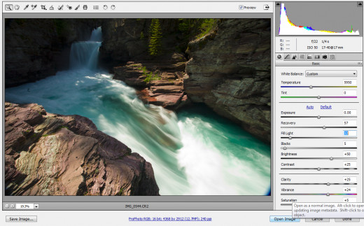
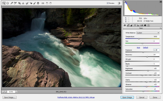
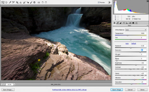
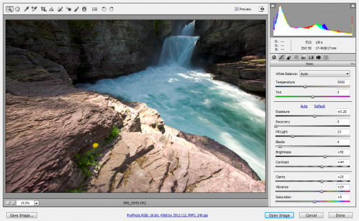
This image uses 3 different images, edited in Adobe Camera Raw (ACR) a total of five different ways.
For the images that will become the right side of the photograph, two exposures were used. This is because of the bright sunlight reflecting off of the water - one exposure could not capture the dynamic range I needed. One image was edited twice in ACR - once for the shadows and once for the highlights, and a second image (exposed for the water), was edited once in ACR, for the very bright highlights in the water.
For the images that will become the left side of the final photograph, only a single raw image was used, edited twice in ACR, once for the shadows and once for the highlights.
These five outputs from ACR are shown below.
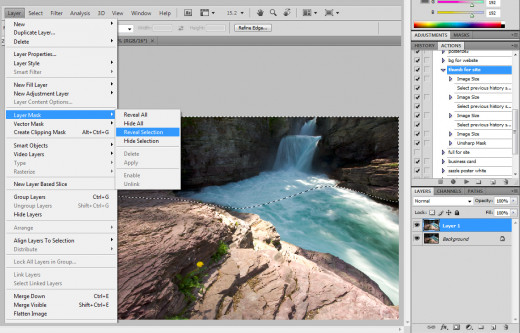
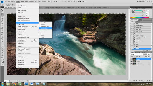
Next, blend the two left-hand images together
I created two images in Adobe Camera Raw from a single RAW exposure, one for highlights and one for shadows, and now it's time to merge them back into a single image. For this, I simply pasted the brighter image (meant for the shadows) in a new layer above the darker image. Then, I selected the shadow areas, feathered the selection, and hit "reveal selection". This creates a layer mask that only reveals the part of the layer that you selected. This method is shown in screenshots below.
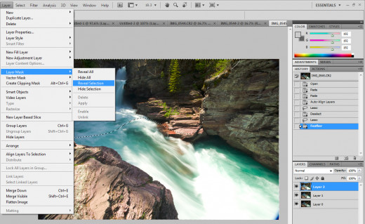
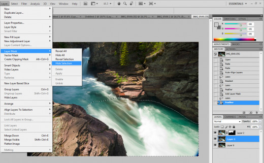
Next, blend the three right-hand images together
Similar to the two images for the left side of this photograph, I had previously created three images for the right hand side in Adobe Camera Raw: one for the highlights, one for the shadows, and one for the very bright highlights in the water. It's now time to merge these back into a single image, too. The technique is identical to the left side. Paste them all as different layers in the same Photoshop file, in order of ascending brightness. Select the shadows of the topmost layer (the one meant for shadows), and hit "layer -> layer mask -> reveal selection". This makes it so that only the shadow part of that image is visible. In the second layer, select the very brightest highlights, and hit "layer -> layer mask -> hide selection". This makes it so that those very brightest regions are hidden in this layer, which means the ones in the layer beneath it show through. Screenshots from this are shown below.
Now stitch the two sides together
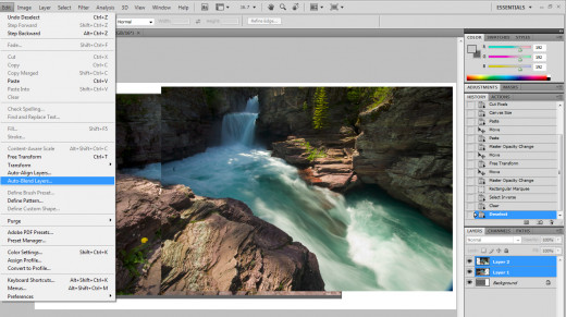
At this point, I have two files, one for the images that make up the left side of the photo, and one for the images that make up the right side of the photo. Each one consists of layers for the shadows and highlights. At this point I'll save each image as a PSD file, which maintains layers, in case I need them later. Then, I'll flatten each, save it as a different name (left vs left_flat, for instance), and begin the stitching process. Usually, I use "file -> automate -> photomerge" to stitch my two sides together. It does a good job, but sometimes you need to hunt around the different types (spherical vs cylindrical vs reposition only) to find which works best. For this image, however, none of them were working! They were all giving poor and unrealistic results.
To get around this, I made a new file, and put each flattened image (the left side and the right side) as different layers. I then aligned them as best as I could, by eye. After that, I did an "edit -> auto-blend layers" with the two layers selected. The result was quite good. Screenshots from this method are shown below.
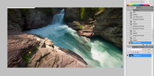
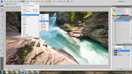
Apply mild Orton Effect
Now that the image has been created from the multiple different exposures, it's time to start editing it as a whole scene, to get the final product I want. One of the first things I try is a mild Orton Effect. The Orton Effect is known for giving a dream-like aspect to photographs. In some scenes, the dreamlike feel is very nice and fitting. In others, it would run counter to the overall feel of the image (which is, of course, a subjective decision to be made by the photographer). In this image, I didn't want a dream-like feel. However, a mild application of the Orton Effect can still be useful, to help pull out some colors, and give the different parts of the image a more locally cohesive tonality.
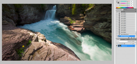
To apply the Orton Affect, first duplicate the main layer three times. To the top one, apply a Gaussian Blur (I usually use between 15 and 30 pixels). Then, change it's blending mode to "screen", and finally merge it with the layer beneath it. This gives you a very bright and blurry layer. Next, change this layer's blending mode to "multiply". This is where many tutorials on the Orton effect stop, but for me, its usually too dark. Before merging it with the layer beneath it, I adjust the opacity slider (for the layer with the "multiply" blending mode). I usually adjust the opacity until the highlights and mid-ranges match my tastes (the shadows always seem to be too dark), then finally merge it with the layer beneath it. Be sure that throughout this process, you always leave an unaltered copy of the image as the base layer. Then, I select the shadow areas of the top layer (which are too dark), and do a "image -> layer mask -> hide selection", which now makes it so the shadow regions from the unaltered original image show through. This method is shown in screenshots below.
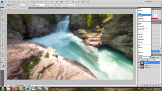
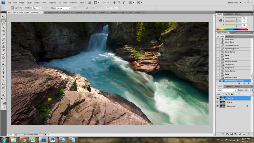
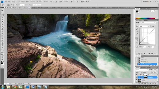
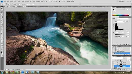
Fine-tuning with Curves and Levels adjustment layers
It's time to do some last fine-tuning adjustments to taste. For these, it's important to get in the habit of using adjustment layers. You can remove the layer at any later point, with no destructive consequences on your image. Plus, they are coupled with layer masks, so you can paint in the layer mask after the fact, to undo (or redo) your adjustments on only certain parts of the image, which is really nice.
First, I did a "layer -> new adjustment layer -> curves", and gave it a slight S-curve to give a subtle overall boost to contrast. I noticed this made a couple highlights too bright (the water and the edge of the front rock), so I painted them black in the layer mask (which means that adjustment layer does not apply to those black regions). The next thing I did was make a curves adjustment layer and a levels adjustment layer that apply only to the rear of the image, and use them to make that part of the image a bit brighter, and boost it's contrast a little more.
After that, I was satisfied, and considered the image completed!

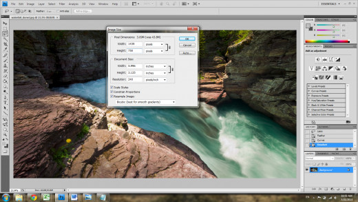
Sharpen for web!
A large print and a small JPG for web showing have different sharpening requirements. My final image, in its largest form, I typically don't sharpen. Sharpening for print is necessary, but best practice is to sharpen differently depending on how big the print will be. Therefore, my master PSD file is unsharpened, and I'll sharpen it before each print I make. However, the web version definitely needs to be sharpened, in order to really make it sing.
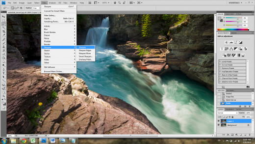
My method for this was taught to me several years ago. First you resize it to 1.5x the size you intend to show it on the web. I intend to show it with a height of 500 pixels, so I resized the image to 700 pixels high. Then I duplicate the layer, and do a simple "filter -> sharpen -> sharpen". Then I duplicate the sharpened layer, and sharpen it again. Right now, it looks significantly over-sharpened.
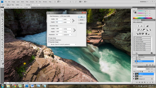
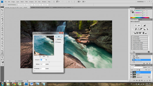
The next step is to resize it to the final size you desire, 500 pixels in this case. I then duplicate the top-most layer (the most sharpened layer), and apply an unsharp mask filter on it (usually 0.2 pixel radius, and 100%). The image now has four layers with four different extents of sharpness. This is useful because not all portions of an image will respond to sharpening filters in the same way, so I can now use layer masks to select different parts of each layer, to get the final image looking exactly how sharp I want it, everywhere. For this image, the top-most layer looked the best over the entire image.
That's it! Hope you enjoyed and thanks for stopping by.